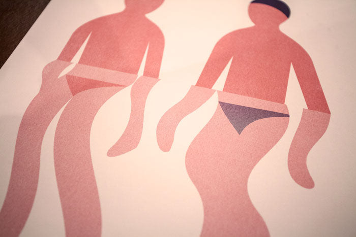
A Short Conversation with Illustrator Rob Bailey
Posted on 30 March 2016

Rob Bailey is a sort of minimalist. His illustrations are comprised of strong lines and bold shapes. His answers to my questions were satisfactory, wasting no language. His website shows you his incredible work, tells you he lives in Manchester, England, and humbly (but impressively) let's you know his client list includes the likes of Google, Ford, and The New York Times. I'm a big admirer of Bailey's work, and I had to see if he'd answer a few questions for me. He was kind enough to do so, and our brief conversation is below, along with a selection of his work...
How did all of the work start for you? One must assume you started with a pencil and a sketchbook as a child?
Same as most creatives I’m guessing. Drawing at school during lessons, mostly Sonic the Hedgehog and Ninja Turtles, although I haven't picked up a pencil for about 15 years.
How did the developing technology of digital art coincide with your process? Or how did vector technology coincide with finding your passion (or home) as an artist?
When I was younger, I always wanted my drawings to be sharper and to have less of a human element to them. Once I was introduced to Illustrator at university, that was it. I never looked back. Although, I’m slowly moving away from exclusively using the computer. Its nice to see the artists hand in the work, and working ‘analogue’ also allows for happy accidents that you just don’t get with the regimented perfection of a computer.

Do you get much time for personal work these days? Or are you doing more and more commercial and commissioned work?
Its probably 50/50. I think its really important to keep a personal practice going. It's nice to earn money, but commercial work never moves the work forward as quickly as personal work.
What is it specifically about the digital quality of your work, making your illustrations in vectors, that attracts you?
The speed is nice, it allows me to get relatively finished images made quickly, and changing colours is a breeze. I feel like I’m at the stage now where I know the rules of Illustrator so well, that I can begin to break them. When I first started, I made very sharp and symmetrical work, I’m trying to be a little looser now. Your style is characterized by big, defined shapes and bold colors. How did you discover this style?
Ive always been drawn to the immediacy of bold shapes and colours, I’ve probably just never grown up from the visuals in baby books. i like the elegance os making an image as simple as it can possibly get with out abstracting it. See more of Bailey's work on his website.